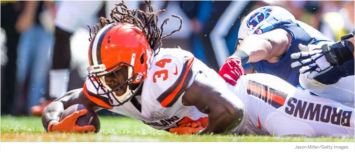
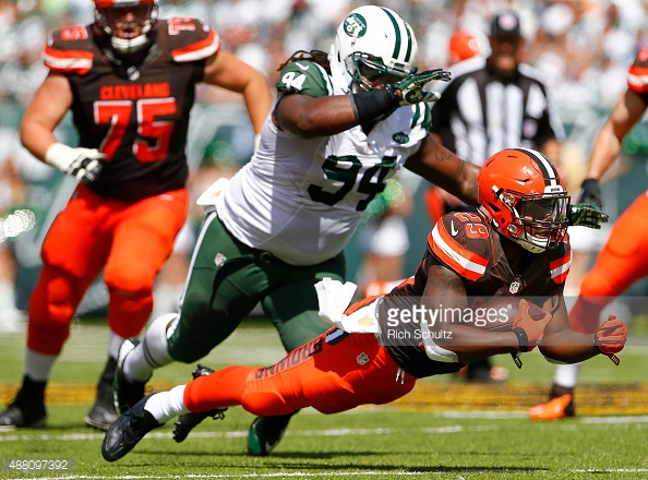
What’s wrong with this picture?
Yes, that’s right, the player is diving forward, and the word BROWNS is upside down.
When using vertical lettering, there are some basic rules about orientation and whether it’s read up or down, but no rules in design are ever set in stone (though vertical retail signage may be). Many factors play into the decision.
In this case, the lettering is positioned vertically on the leg, but with a massive screw-up, in my opinion – which is surprising because I’m not sure I’ve ever seen something Nike has created and immediately thought “that’s wrong”.
Why would you want the word BROWNS to be readable right-side up only if the player is laying flat on his back?!
Did they not think of it, or is it just more proof that God hates Cleveland? Some intern designer thought it’d be funny have BROWNS clearly readable every time Johnny Manziel gets sacked, apparently.
In football, if you’re on your back – with the exception of making snow angels in the end zone – it’s almost always a bad thing. Contrasted with if you’re diving headfirst, whether on offense or defense, it’s generally a good thing.
At the very least, that’s a much more common position during play than being flat on your back.
And if the argument is so that the word BROWNS comes horizontal when a player is running, that’s valid, but from a photo perspective or even TV slow motion, the % of times a player will be seen at that precise high-knee moment from the side is much lower than the % of times a player will be seen in some sort of diving or falling forward (or backwards, in the case of the Browns!) position.
I’m sure this one inspired a lot of hot debate between the designers at Nike when determining which way to position the word BROWNS. I totally disagree with the viewpoint that won out.
In the end, it must have been the Browns who called the play. ;)